Designing a subscription manager that gives users control, clarity, and savings. Helping people take charge of their digital spending by simplifying the way they discover, track, and manage online subscriptions.
Fintech UX
User Testing
MVP Design
The Problem
From user interviews and early market research, we discovered:
85% of users didn’t know how much they were spending on subscriptions
Most couldn’t recall which subscriptions were active
Many were reluctant to cancel because of unclear billing dates and fear of losing access
Without transparency, trust was low and cancellation felt like a hassle
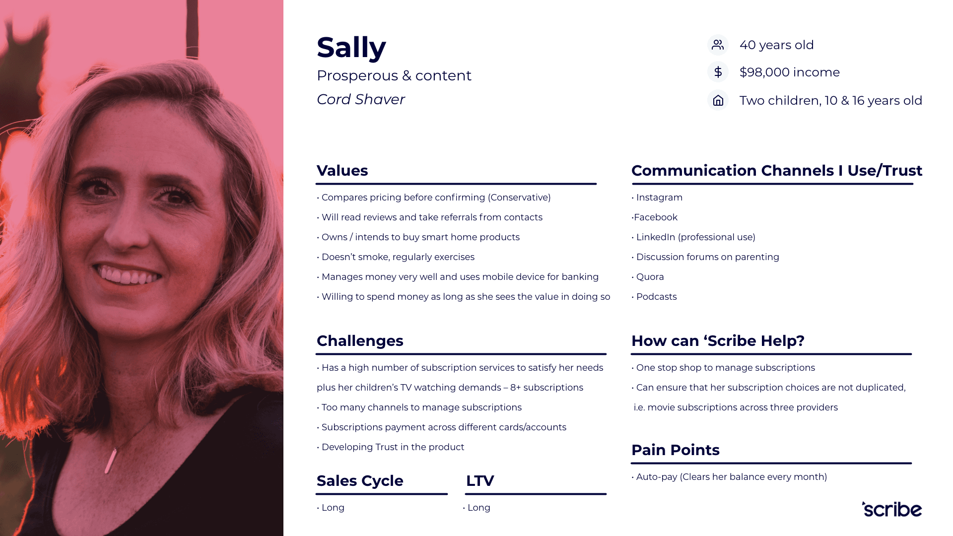
Research and insights
I ran interviews with target users (students, professionals, and budget-conscious families) and mapped out their behaviours and blockers.
Key insights:
Users wanted to reduce spending, but weren’t confident in what they could cancel
Most had no centralised overview of billing cycles
There was high interest in savings tools, but low trust in financial apps

Experience & Strategy
To solve this, I focused on designing a product that felt:
Supportive, not overwhelming
Helpful, not bossy
Simple, but powerful
I structured the product around three clear value pillars:
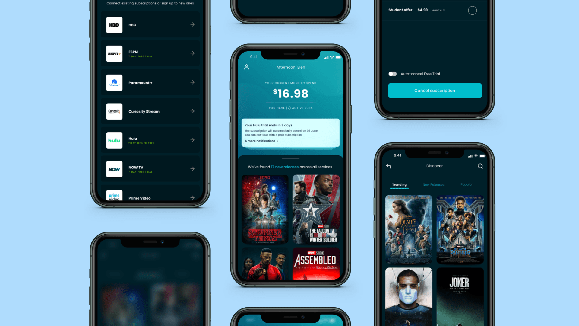
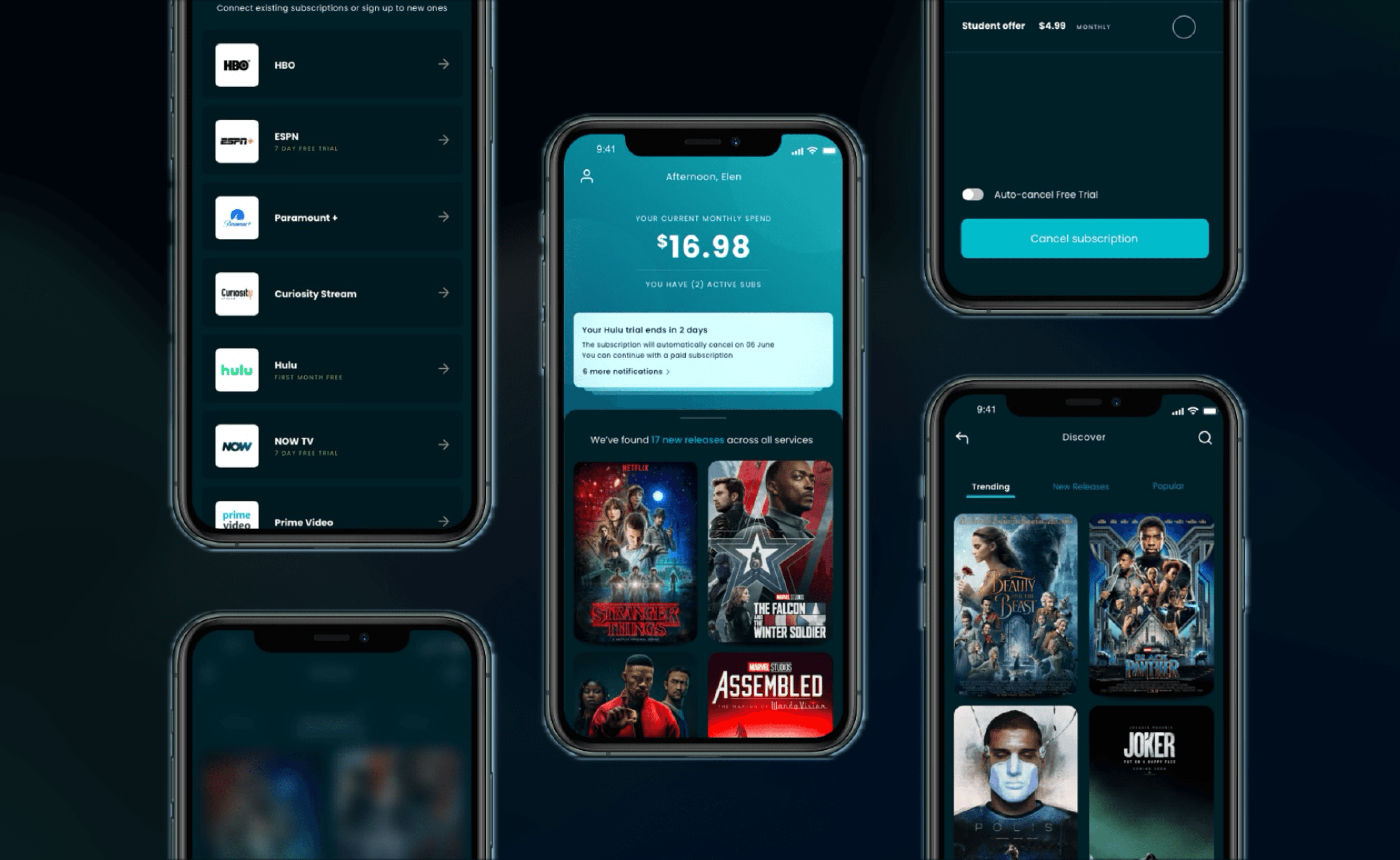
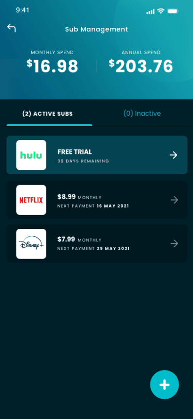
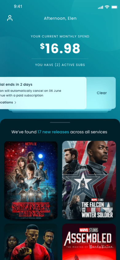
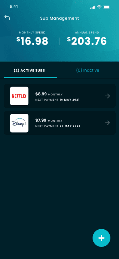
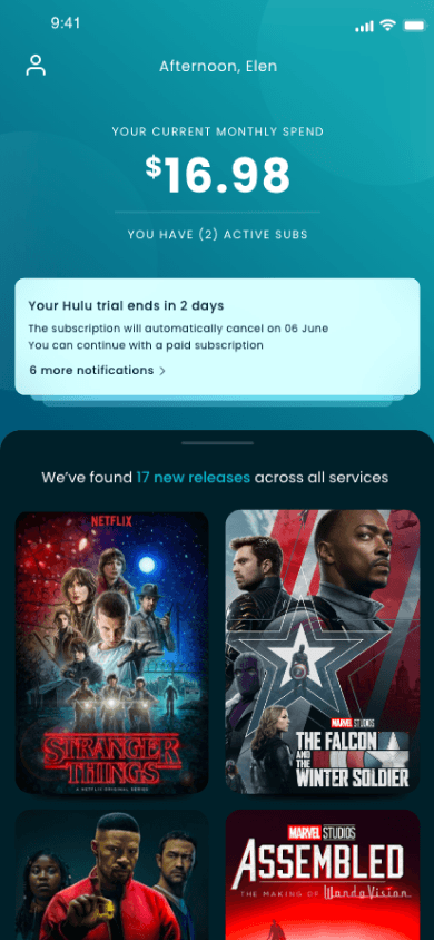
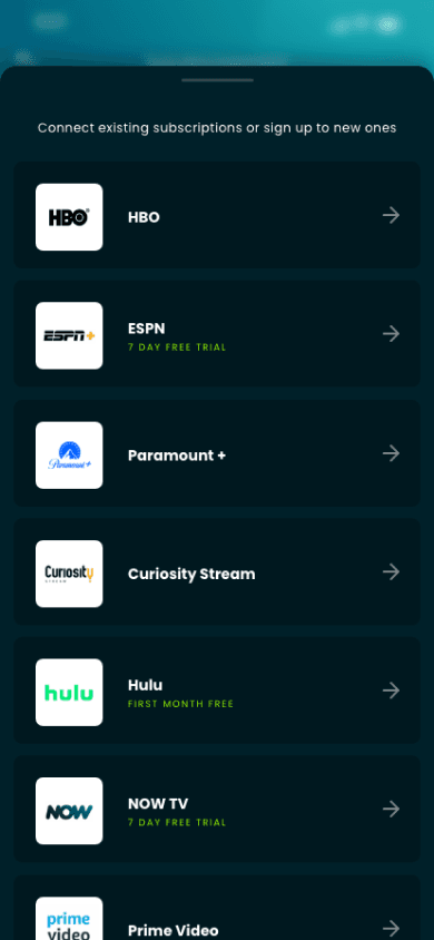
Visibility – See all your subscriptions in one place
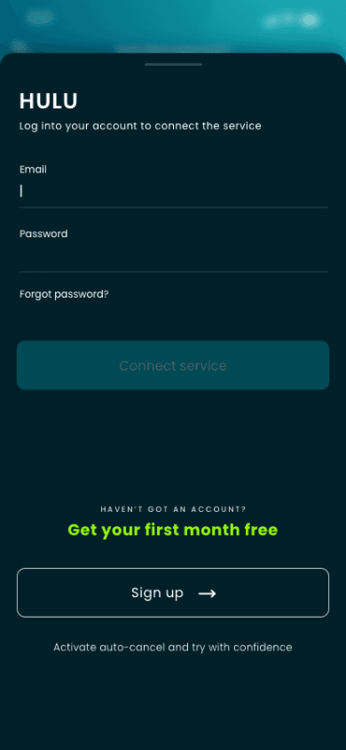
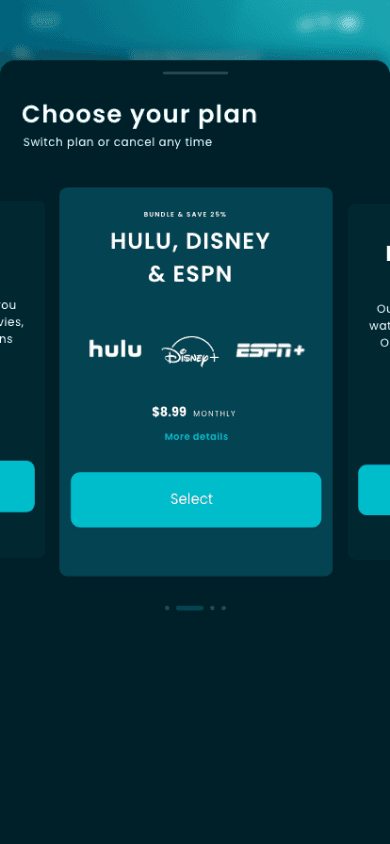
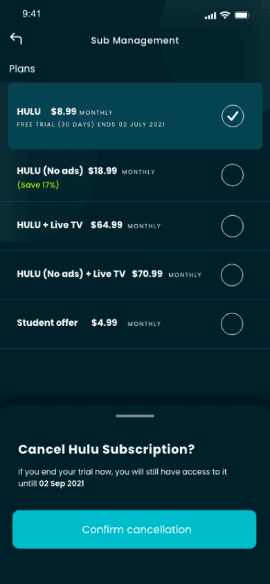
Control – Cancel, pause, or switch plans instantly
Savings – Discover better deals tailored to your habits out their behaviours and blockers.
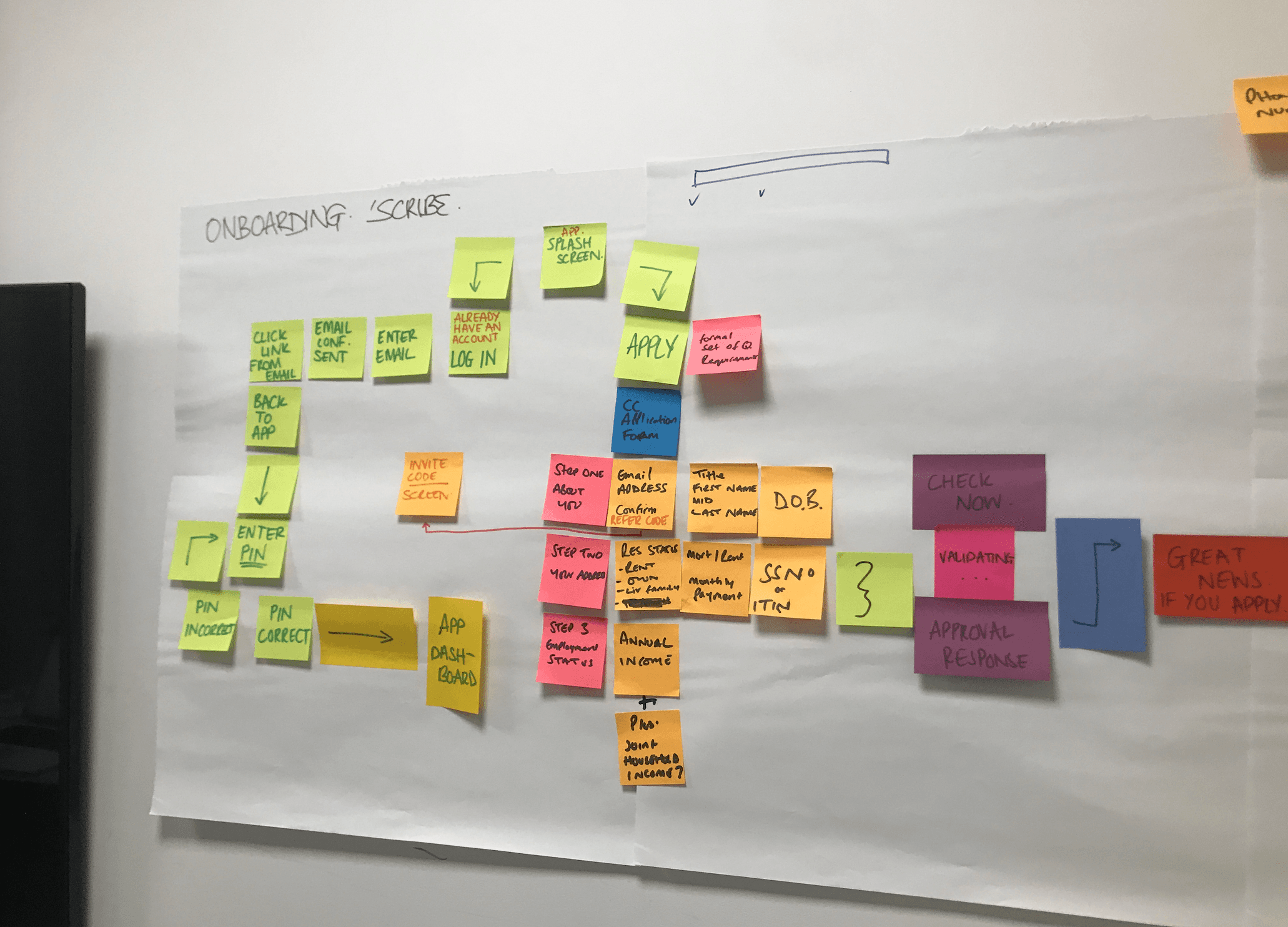
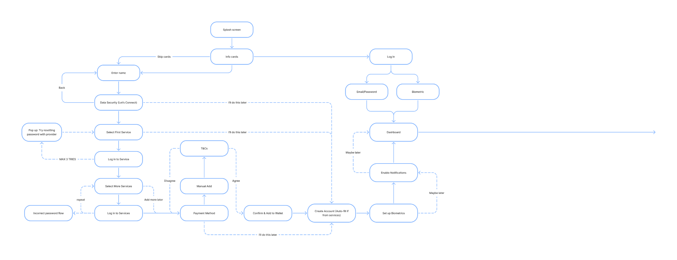
The design process
I moved through rapid prototyping and user testing, working in tight feedback loops with the PM and dev team.
Key design principles:
Use simple, friendly language - no fintech jargon
Provide previews before any action is taken
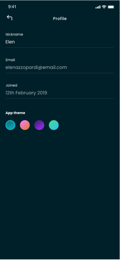
Let users switch between a detailed or minimalist view
Dark mode by default to match the “money tracking” mental model

Testing & Iteration
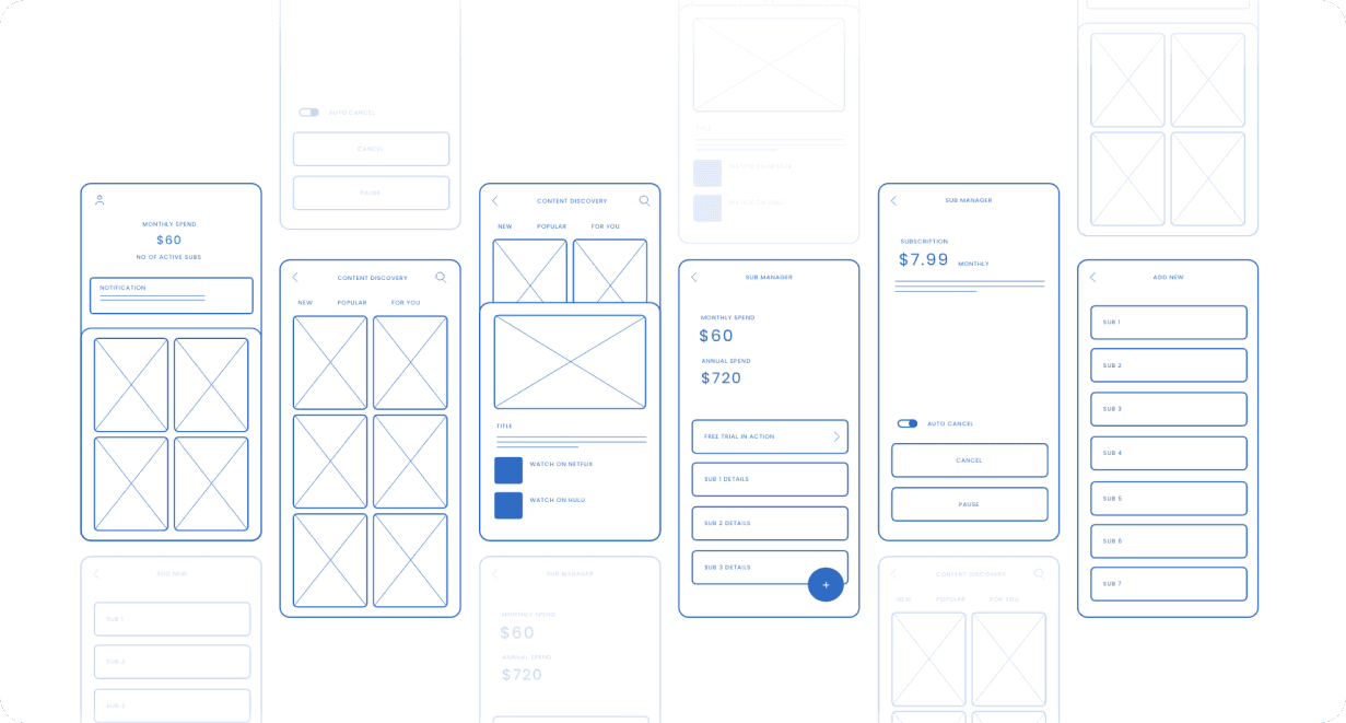
Final Experience
The final MVP delivered a calm, intuitive interface that offered:
A smart dashboard that breaks down total spend
Tools to pause or cancel subscriptions with one tap
A deal finder that recommends better plans based on usage
Real-time tracking and notifications for upcoming payments


Outcome
Scribe launched as a private beta and quickly validated its value with users:
60% of users cancelled or paused at least one subscription in the first week
Average estimated savings: £18/month
87% said the dashboard made them “feel more in control” of their finances
Following its success, the product was acquired as a white-label application by a major US telecom, who saw an opportunity to offer it as part of their customer loyalty ecosystem.
What i'm Proud of
Designing a product that genuinely helped users reduce financial anxiety
Delivering both user value and commercial success - from prototype to acquisition
Creating a clear, approachable interface for a complex backend
Balancing short-term MVP execution with long-term product vision